3 posters
This Is SICK !!!
Oledis- Owner
- Posts : 40
Join date : 2009-08-14
Location : Romania/Bucharest
- Post n°2
Re: This Is SICK !!!
Destined- Normal Users
- Posts : 66
Join date : 2009-08-15
- Post n°3
Re: This Is SICK !!!
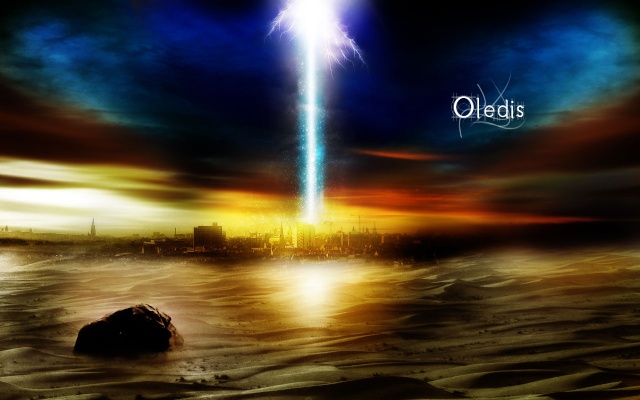
The sky needs to have lower opacity or set to soft light, it looks way to dark. Also, try to blend better. Take a 20 px soft brush with 20% opacity and erase the edges slowly, then blur it and smudge VERY lightly, it'll give it a way better apperence and it'll blend better. The text completely MURDERS the whole piece. The text terrribeleee. And whats with the lines behinde it?
Gods 3lite- Normal Users
- Posts : 133
Join date : 2009-08-15
Age : 31
Location : In a Cookie Jar
- Post n°4
Re: This Is SICK !!!
I dont see anything but the used wallpapers in the second post..the only thing in first post is text..but umm yeah cool i guess? lol
**edit** i take that back holy CRAP that is amazing!!! i dont care what the person above me says...
|
|